

Long-Term Holder Patterns

Hello folks, and welcome to another edition of The On-Chain College newsletter. Today, I will dissect the Bitcoin Supply Last Active 1+ Years Ago chart and show you the true signal that I take from this chart.
Let’s Jump In:
Supply Last Active 1+ Years Ago
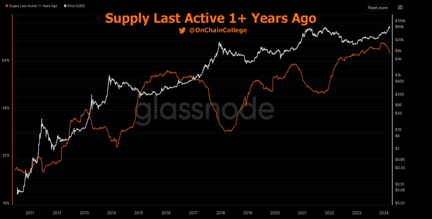
The white line is price, right axis is price $, orange line is the BTC supply that hasn’t moved in at least 1 year, and the left axis is the % of the supply that hasn’t moved in at least 1 year.
With On-Chain Analysis, unlike traditional technical analysis or fundamental analysis, we can look at supply metrics and gain insights from the patterns that develop over time.
Why do we care about the supply metrics? Well, the blockchain is immutable and trustless. This is the true data pulled from the blockchain that is not altered by a central bank or biased by an institution. By analyzing the supply metrics, we can start to see the psychology behind investors and traders and help gain an edge in making a probabilistic bet about where we’re headed in the future.
So what do I see on this chart?
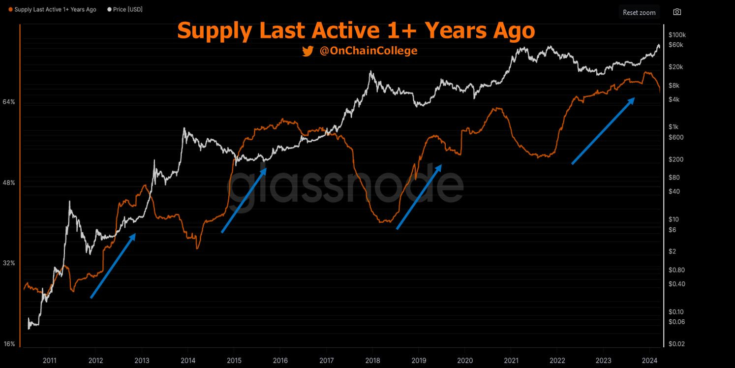
First observation is that we can see this metric increase during bear markets (blue lines). This is due to a few reasons.
Some people bought the cycle top and as price declined, they got stuck with the asset and have decided that they’re long-term holders now instead of selling at a loss.
Other, more convicted holders, use the bear market as a time to dollar-cost average buy or smash buy Bitcoin. These holders see the opportunity in buying low and holding for years for potentially higher returns.
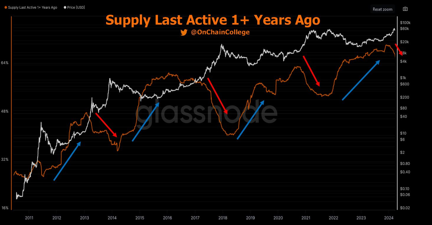
Conversely, we see this metric decline during bull runs. This is the visualization of long-term holders, aka smart money, selling into strength and realizing a profit on the BTC that they bought during the bear market and prior cycles.
We can notice that this metric has been decreasing over the last few months.
One could deduct that this is the start of the next bull cycle top. Price certainly has risen to levels where this behavior makes sense.
The only caveat is that a lot of this supply has decreased this year as GBTC holders have sold out of that ETF. These sales are not necessarily typical long-term holder selling, as a lot of the GBTC outflows have led to inflows in the other ETFs with lower fees than GBTC.
This one caveat still gives me pause on whether this is the parabolic, bull run or if this move is similar to the 2019 post-bear market, where price will then chop for a year or so before the big parabolic run.
The data is the only thing that can confirm or deny this, and we must continue to monitor it, not make predictions, in order to be successful in our moves.
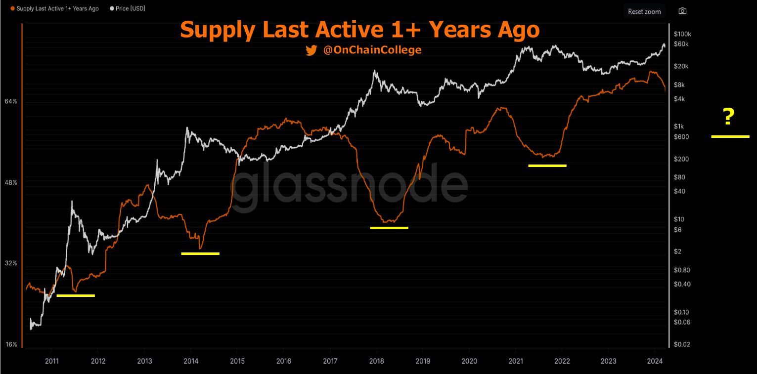
We can also see that each cycle, the bottom of this metric plateaus at a higher level than the past.
Put differently, more supply moves into this cohort each cycle. This cohort of long-term holders are the most convicted in Bitcoin, compared to short-term holders (defined as supply moved within the last ~5 months), so simplistically put, the higher this metric the more bullish in the long run for BTC in my opinion.
I added a question mark in the future as one could expect this metric to plateau at a higher level than previous cycle lows (yellow lines). If we make this assumption, we can monitor this chart as the cycle progresses and keep an eye for when it starts to level out. This would be an indication to me that the cycle has likely already peaked and we’re in the bear market decline.
It’s also important to note that this metric will likely continue to increase over time, even if you assume a consistent or slightly declined amount of support from this cohort, due to the fact that this metric tracks lost supply. Unlike a bank, when you lose your seed phrase and cannot access your BTC, it is lost and will continue to be counted in this metric.
As Satoshi Nakamoto said, “Lost coins only make everyone else’s coins worth slightly more. Think of it as a donation to everyone.”
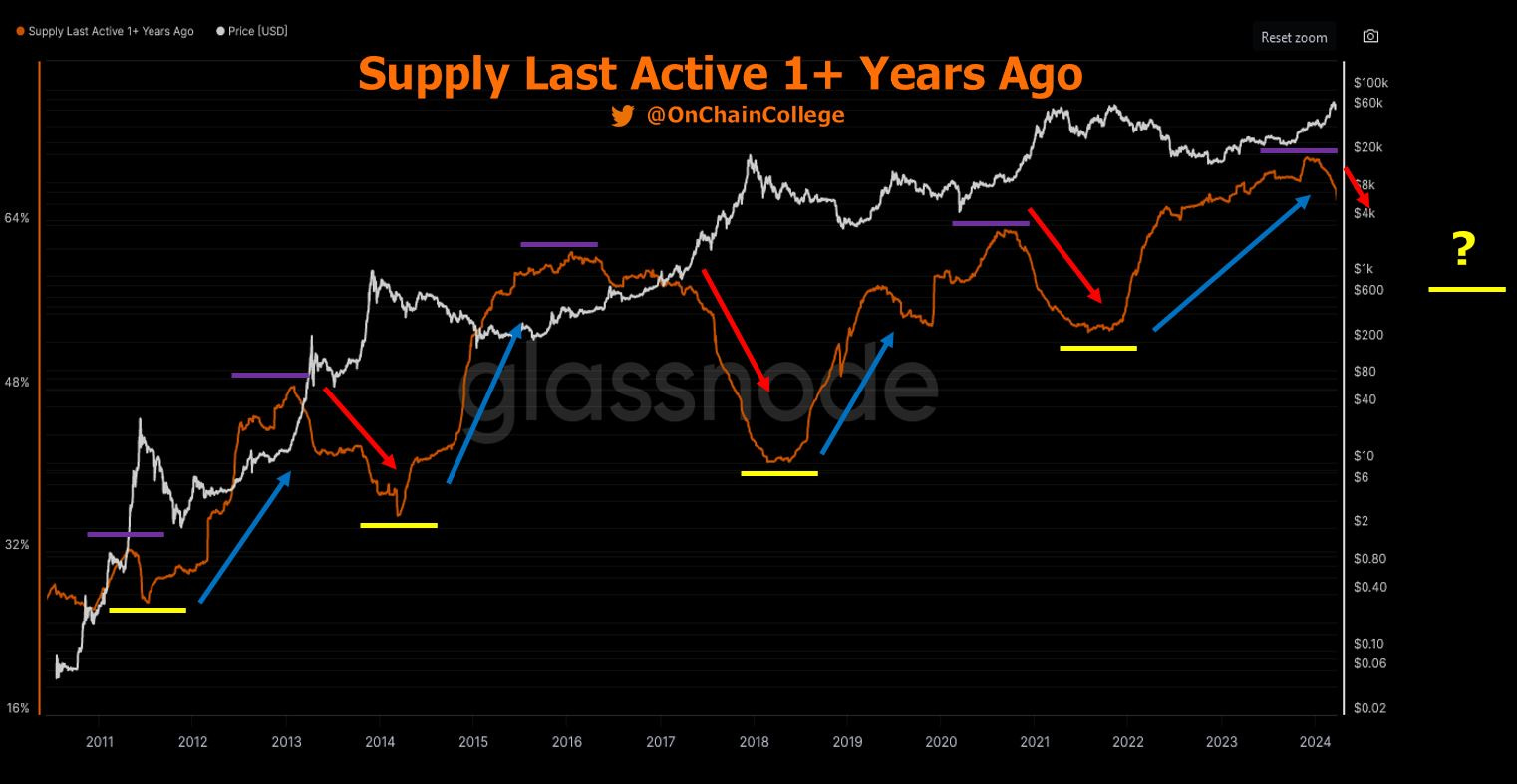
Wrapping it up, we can see that the purple lines highlight that this metric also peaks higher each cycle.
This most recent peak was higher than the past cycle peaks, giving some confidence to the fact that this may indeed be the parabolic run and not comparable to 2019, as the 2019 peak was lower than the prior cycle.
We can only wait and monitor and look at a confluence of other metrics to build our bias towards the market and act accordingly.
Always a pleasure writing my thoughts out in a longer form than an X post.
Thanks for reading and enjoy the rest of the week!
-OCC
Data and charts source: Glassnode.com
DISCLAIMER:
This report expresses the views of the author as of the date it was published, and are subject to change without notice. The author believes that the information, data, and charts contained within this report are accurate, but cannot guarantee the accuracy of such information.
The investment thesis, security analysis, risk appetite, and time frames expressed above are strictly those of the author and are not intended to be interpreted as financial advice. As such, market views covered in this publication are not to be considered investment advice and should be regarded as information only. The mention, discussion, and/or analysis of individual assets or securities is not a solicitation or recommendation to buy, sell, or hold said asset or security.
Each investor is responsible to conduct their own due diligence and to understand the risks associated with any information that is reviewed. The information contained herein does not constitute and shouldn’t be construed as a solicitation of advisory services. Consult a registered financial advisor and/or certified financial planner before making any investment decisions.
This report may not be copied, reproduced, republished or posted without the consent of On-Chain College, without proper citation.